Monday 6 May 2013

Good Friends

For this layout I have no idea who is the paper manufacturer. This is a layout a created a little while ago. Again it was one of those layouts that followed the theme; older picture, older paper. I used some flowers and die cuts that I had in my stash. The title is a stamp ( 7 Gypsies) I've had in my stash forever and I thought it would be a great time to show it off. I chose a pale color scheme for this layout because I thought it went great with the blue background of the sky and ocean that is behind us in the pictures. During this use your stash exercise that I'm going through I'm tending to focus a lot on color instead or pattern design. This is helping get through my layouts much more quickly, and it's helping me a lot with the organization of my craft room.
This is a simple and quick layout and I'm soo happy that I was able to get this memory down before I forgot it. Hope this inspires you to use some of your older stash. TFL


Sunday 5 May 2013

MME and PageMaps Sketch challenge - See me giggle and go

I love My Mind's Eye. They have such a great range of products and style that really appeals to any style or look that I'm trying to achieve. In this layout, I used several products from a couple of different lines. I used "The Sweetest Thing" collection as a background paper, the stamp set is from the "Stella and Rose" doliy stamp set, and the I used the " My Girl" collection as paper layering and embellishment. I finished off the layout, with some washi tape, ink splatters, and AC Thickers, in two different fonts.


I know I'm a little late on the submission, but I'm going to post it anyway on the PageMaps website, since I always think it's great inspiration.

TFL and be inspired.

Soupe Afrodisiac- MME State of the Heart

Yes, you read right, this is a paper pack released from 2010. Like I said, I'm trying to use my stash. My scrap room is full to the max of stuff I actually want to use. I decided that I would use older papers with older pictures. This is an older picture from Valentine's 2011. We usual never do anything for Valentine's Day, its something we brought over from dating in university. Valentina's day always used to fall around mid terms, so it was never a great time to celebrate.

Anyways this year, we decided to invite some friends over for Valentine's. I created a theme for the dinner which was aphrodisiac food. We kept the night easy, I made Miso soup and fried vegetables as appetizer, then we ordered in some sushi, and for dessert I made chocolate fondue. The title is in french since the friends we had over are French Canadians, and we often speak french with them.

I'm pretty happy with how the layout came out. I used a sketch that I pinned on my Pinterest account. I LOVE Pinterest. Heres the link: http://scrapbookgeneration.blogspot.ca/2012/07/debbie-sanders-sketch-layout-for.html

I must admit this is my first two page layout I have ever done, and I think I will be doing more. Here's an over all look of the two pages:


Here is a closer look at each page:


TFL, hope this inspires you to create something.

Saturday 13 April 2013

Pop Culture Layout- Elements of being a Hipster

Here is a more recent layout I did for a challenge that Kathryn over at Life on the Scrap Beach is having. It was an amazing challenge about scrapping about things in pop culture. My husband and I and total hipster's, which is trending right now. This is one of the many pictures I've taken of us at Starbucks and knew that this would be a great time to scrap it.

For this layout, I used Studio Calico's Yearbook collection. I used some of the brighter colours in this collection. The border strip in the middle of the page, is a stamp from the Amy Tan Yes, Please collection. I repeated it several times, in order to merge the two different pattern papers together. I finished off the page with some classic elements like heart wood veneers, twine, washi tape and enamel dots. Lastly, the journaling states all the reason why were hipsters, and why we love it so much.

Lifeonthescrapbeach.blogspot.com

TFL!


Wednesday 3 April 2013

Using scraps to make cards

Late last year, I reorganized and cleaned my scrap room. Ever time I would walk by my room it would overwhelm me. It would literally suck the inspiration out of me. When I first walked into my room, I decided to attack my scrap pile. I originally organized everything by colour and each colour got a different bags. I noticed that this was taking a lot of valuable space. To get this space back, I limited my scraps to a single much smaller bin, which means I had to purge a lot of papers. I learned from this exercise I decided that I needed to stop creating scraps when I create a project. Once I'm done with this project, I started making cards, from the scraps.

Here are the cards I made with the scraps from the previous post. I'm very happy with how cards came out. I'm planning on sending my extra cards to Operation Write Home.


Here is a little closer look, I used some coordinating cardstock and washi to create these cards:


TFL, hope this inspires you.
Angie

Friday 29 March 2013

Fun Play Time - Authentique Paper Collection Loyal

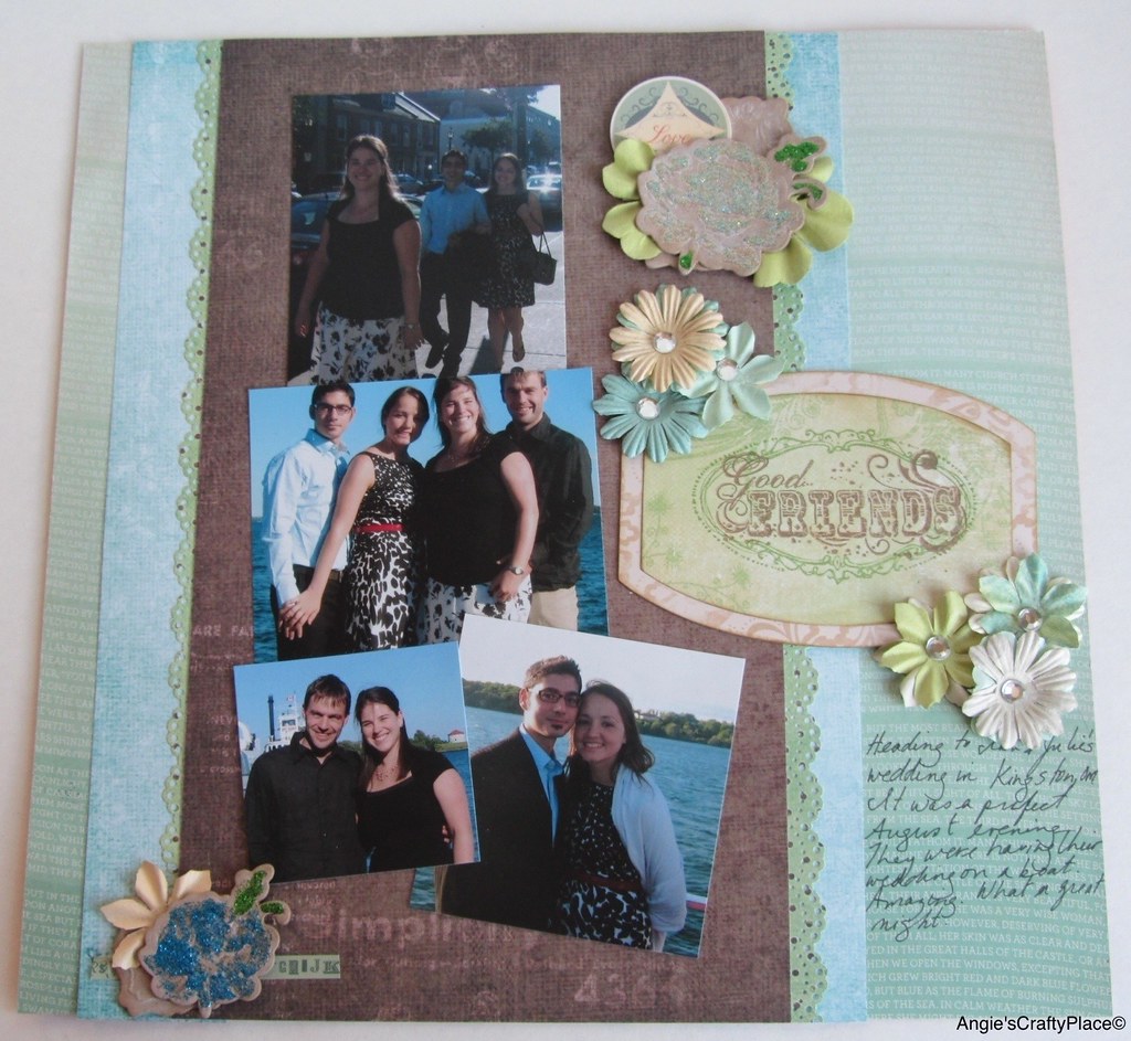
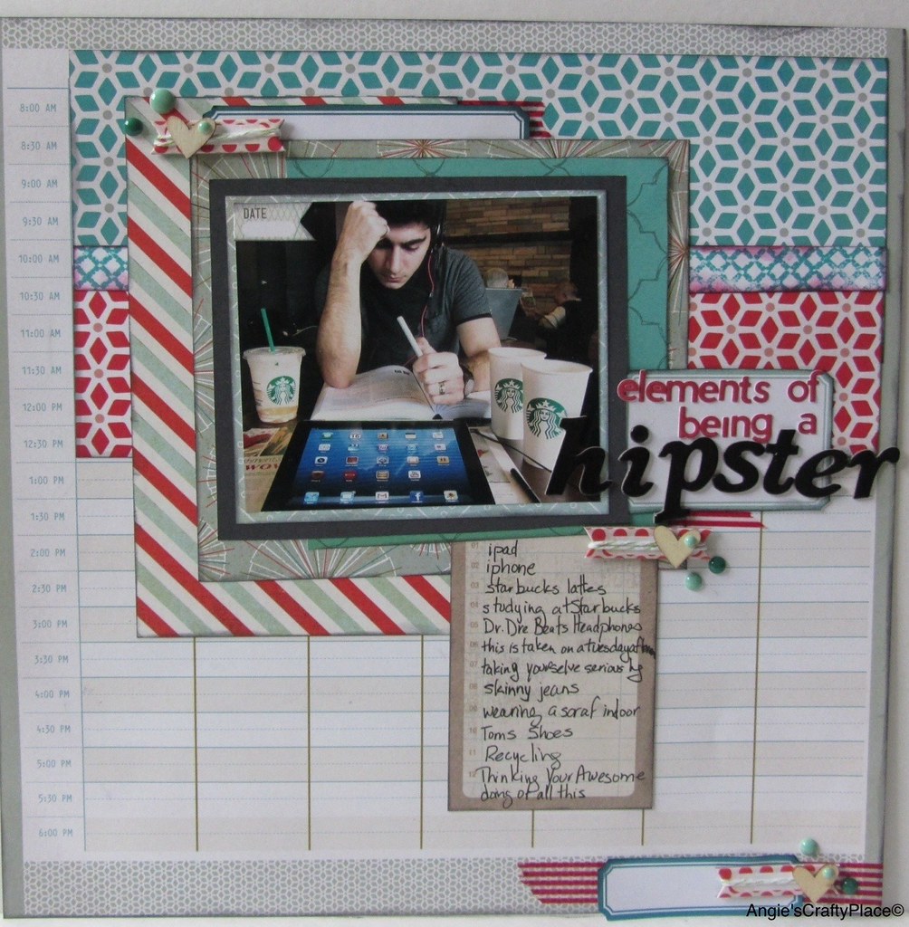
Here is another older layout I did last year. I really don't like it, but I'm ok with that. Scrap and move on I say. If I ever run out of pictures one day, I'll go back and re- scrap it. I think I may go back and add journaling before putting into the album tho( yes, it's still not in the album, I'm bad about that kind of thing).
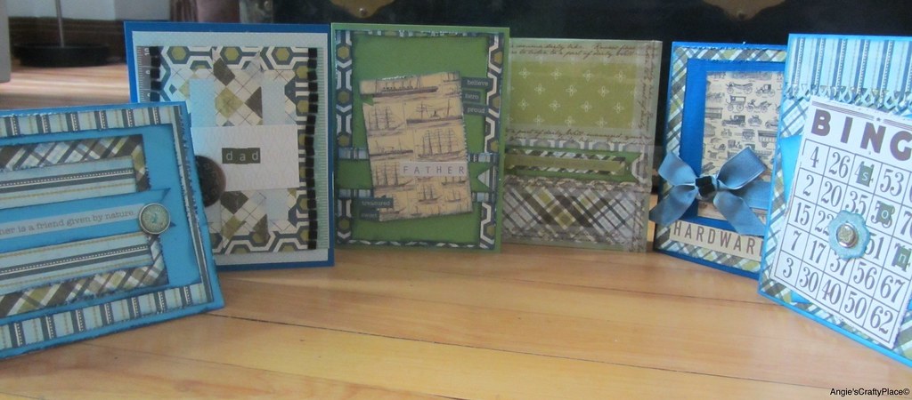
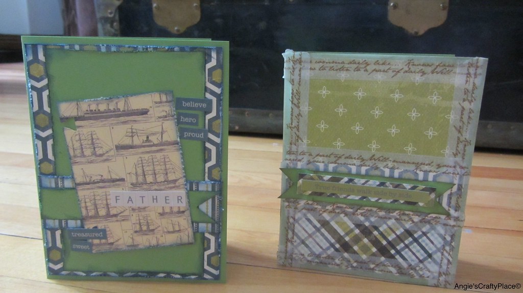
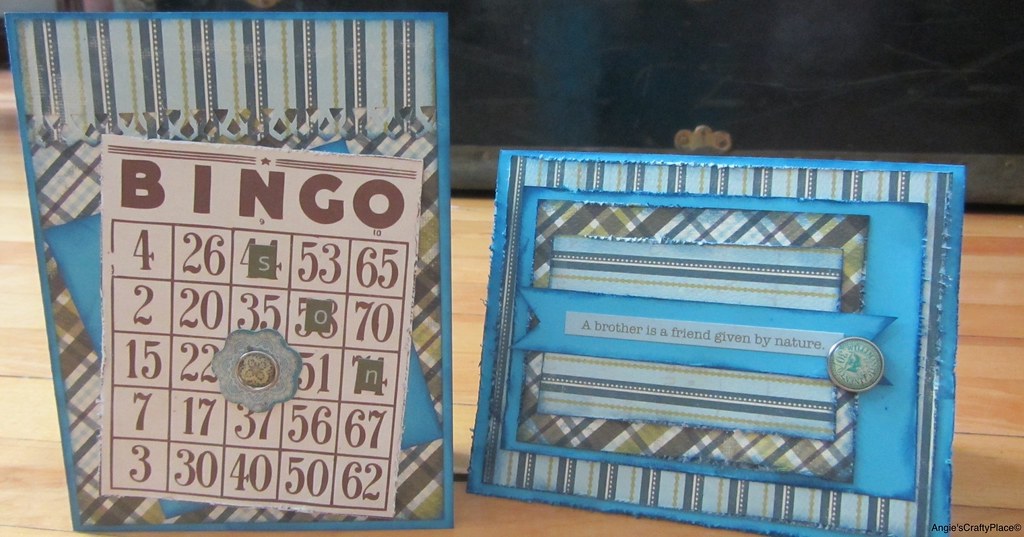
On this layout, I tried a couple of new things. First, I changed my shopping method when purchasing papers. Usually when I see paper I really love, I buy one of each paper in the collection. Then when I go back to use them, I have tons of left overs, because I only needed a few papers for a couple of layouts. This time I tried to only buy 3 papers for the collection, since they were doubled sided, it was like using six different papers. This method worked pretty well for me on this layout, however I do think that I should have used a solid cardstock to break up the patterns a little more. I think this is one of reasons why I dislike this layout, everything is blending into each other.
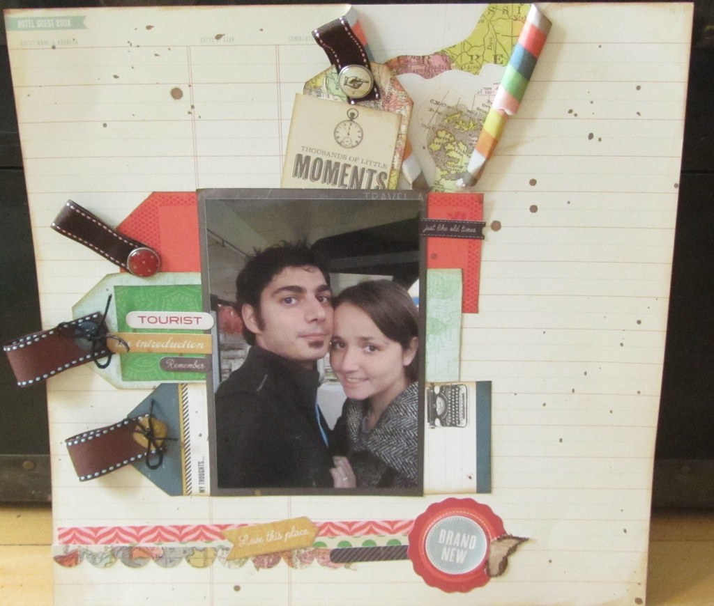
Also, on this layout for the first time, I used the ever so trendy string banners and fish tail banners. I really enjoyed incorporating these elements on a boy layout. I think there great accent elements, and extremely gender neutral. I am in love.
Lastly, I finally used some of my Tim Holtz stash. I have been hoarding my goodies since I've taken my first Time Holtz class over 3 years ago, honestly, thats pure insanity. Use up my stash is my motto. There will always be more stuff that is super cute, and that I will probably buy, lol.
TFL! Hope you were inspired to use your stash, and if your layout is less then pretty, embrace it.


Sunday 17 March 2013

Thousands of Little Moments

So I know it's been a little while, but I can assure you that I have been crazy busy and my life has changed drastically. I'm slowly getting back to my old life, and I want to make sure that I include blogging as part of my new life. I have been scrapbooking a little, so expect quite a few blog posts from me in the next little while. I have also embarked on the Project Life Adventure, more on that in another blog post. For now here's an older layout that I wanted to share with you guys.

Here's a layout I did for Scrapbook Nook layout challenge (which sadly is no more).(A little disclaimer, this has been inspired by a layout I saw on Pinterest, and is not my original design.) I used the Crate Paper StoryTeller collection and other related products that came in that kit. I love Crate Paper's cut away tag sheets. They are so prefect for adding just a little touch. In this case I used them in 3 ways. The first was as a title, and journaling spot ( which is the second way). I loved the double use of this Tagore the layout. I'm still trying to getting used seeing my own handwriting on a layout; it's so ugly, uneven, and often I misspell words. The last way I used the tag cut away page was as an embellishment cluster on the left hand side of page. I added brads and ribbon to add more dimension and texture to the page. Lastly, I am really loving the splattered look to pages, it really is a great way to cover up empty space with making it look to busy. Hope you enjoyed this post. TFL.


Here is a close up of my title and journaling tag.